Wild Planet Sardines
Packaging Design // Digital Marketing
Challenge: Wild Planet sardines come in many flavors, but they were not individually distinguishable, making it difficult for customers to choose a product and complete their purchase.
Solution: I redesigned Wild Planet sardine packaging using bright, distinct colors and readable type, accompanied by shapes and colors that harken back to the California coastal origins of this sustainable product. The packaging goes hand in hand with a digital marketing campaign. (This was a personal project.)
Packaging


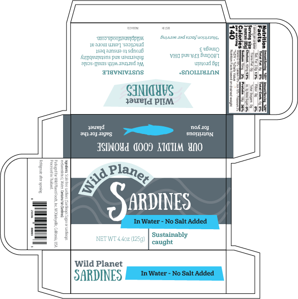
Packaging with Dieline
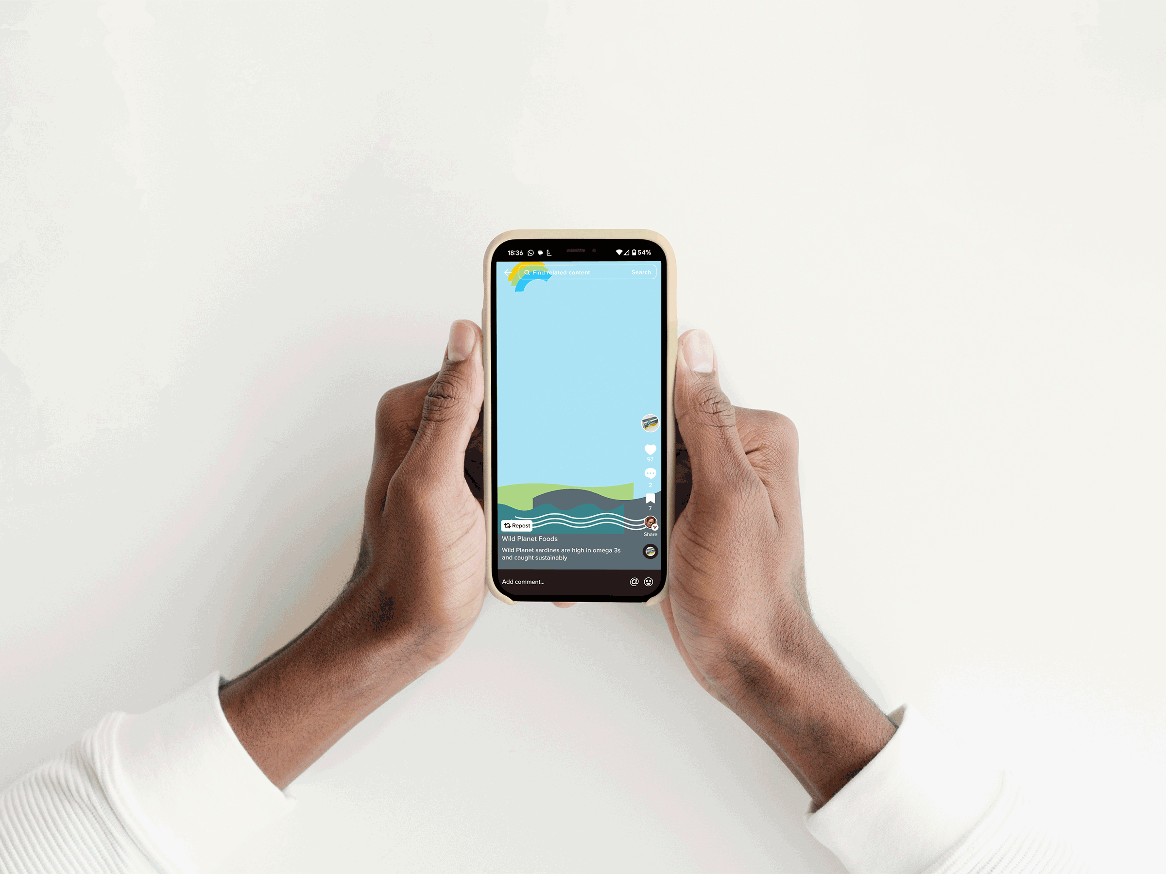
Digital Marketing
Styles

Shapes
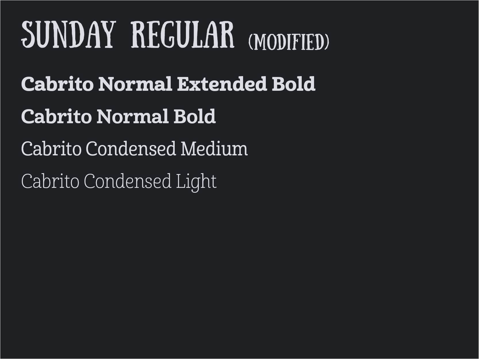
Fonts

Colors
Concept
The Wild Planet brand is deeply rooted in Northern California, where there’s a history of sardine fishing, and the new brand’s visual language reflects the feeling of that environment, both natural and man-made.
This packaging design distinguishes Wild Planet from other brands using a playful display typeface that captures the slightly off-kilter, handmade aesthetic of fishing and climate activists.
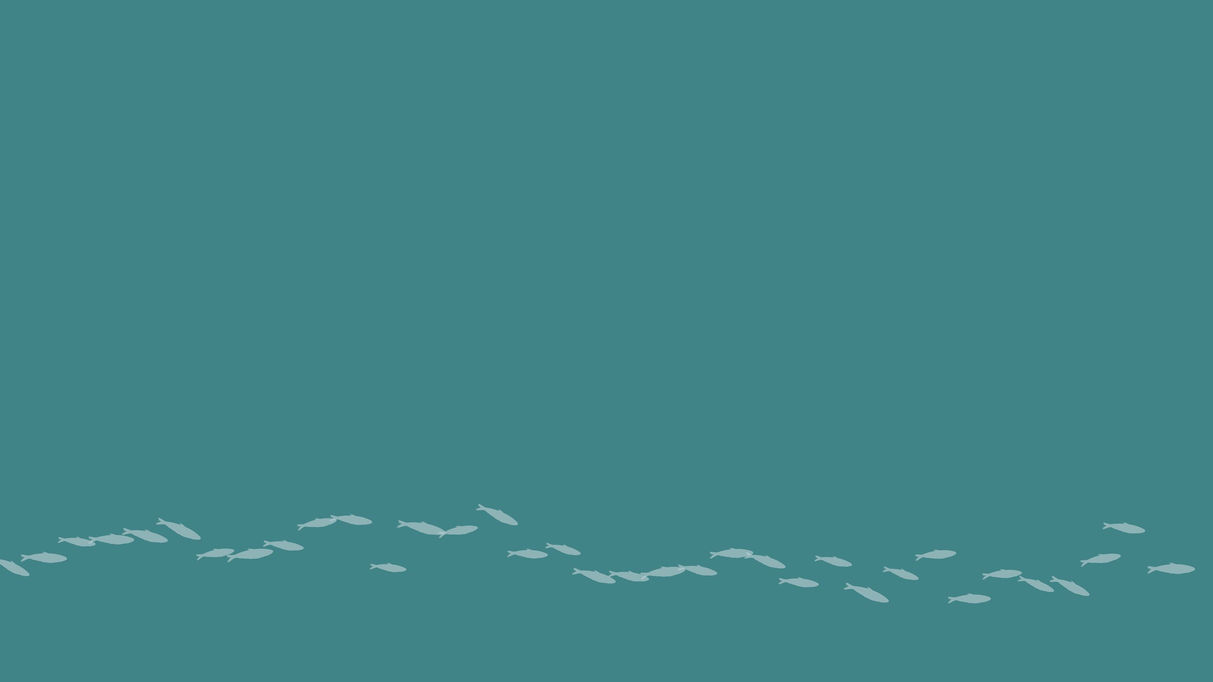
The muted ocean and sardine scale tones contrast with bright colors to further differentiate the brand. Wavy shapes emphasize Wild Planet’s fresh-from-the-sea promise.
The slab serif body text hearkens back to some of the architecture of the original sardine canneries on the California coast, while also being easily readable.
Minimal text highlights sustainability and nutrition, on the front, side, and back of the package.
Flavor information is consistently in the same area of the package and in different colors for easy differentiation.
Keep reading for my process…
Brief
Wild Planet is a brand of tinned fish based in Northern California. They use sustainable fishing practices and educate consumers about protecting the ocean. Their sardines are priced mid-range.
The target audience for Wild Planet is Americans who are conscious about the environment but still consume animal products, and who are drawn to sardines because of their high nutrient content.
Wild Planet’s current flavor labeling isn’t consistent, so the challenge was to find a design flexible enough to work across many flavors and to distinguish each flavor clearly, all on a small box. In addition, Wild Planet’s current packaging is utilitarian compared to other, more flamboyant sardine packaging. The new packaging must distinguish itself, highlighting the nutrition of sardines and the sustainability of Wild Planet.

Original Packaging
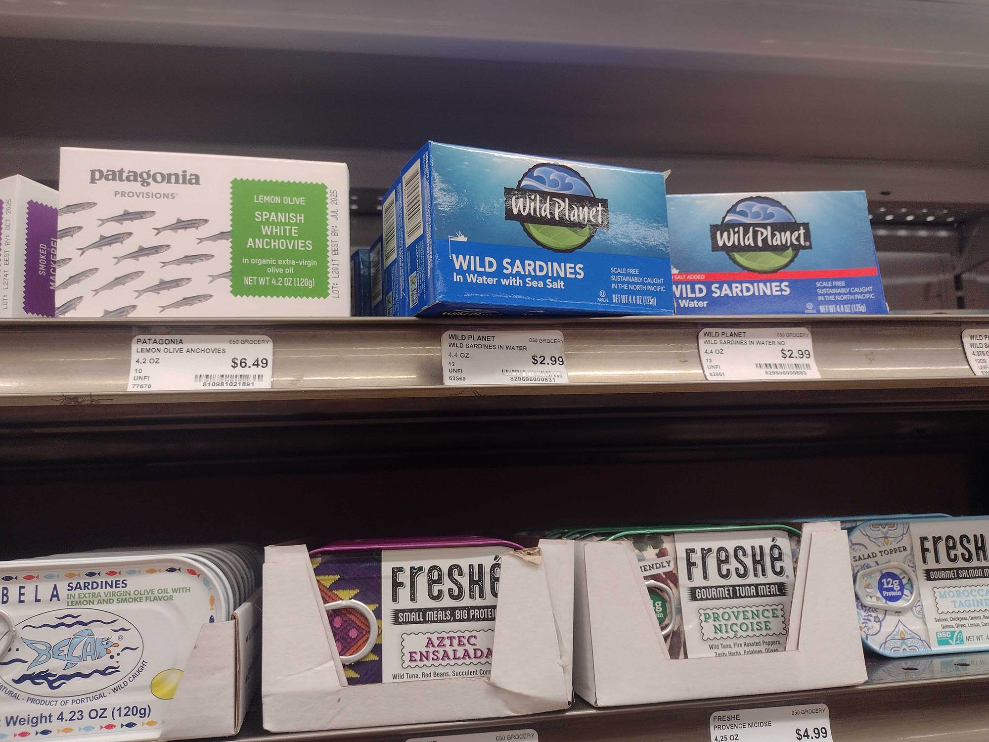
On the shelf
Research Insights
My research took a few different paths. I researched old-timey maritime aesthetics, the California coast where Wild Planet sardines are from, and climate activist signs and art.
Each of these paths inspired my final design, but the California coast was the most interesting to me, as I saw pictures of the old canneries along the coast and the typefaces they used in their architecture.
I wanted to pay homage to the magnificent silvers and green-ish blues of sardine scales and their habitat.
Moodboards
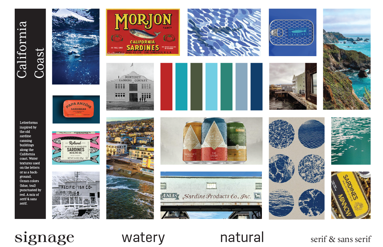
California coast
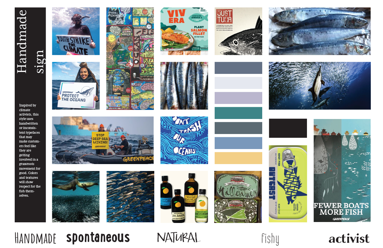
Climate activist signs
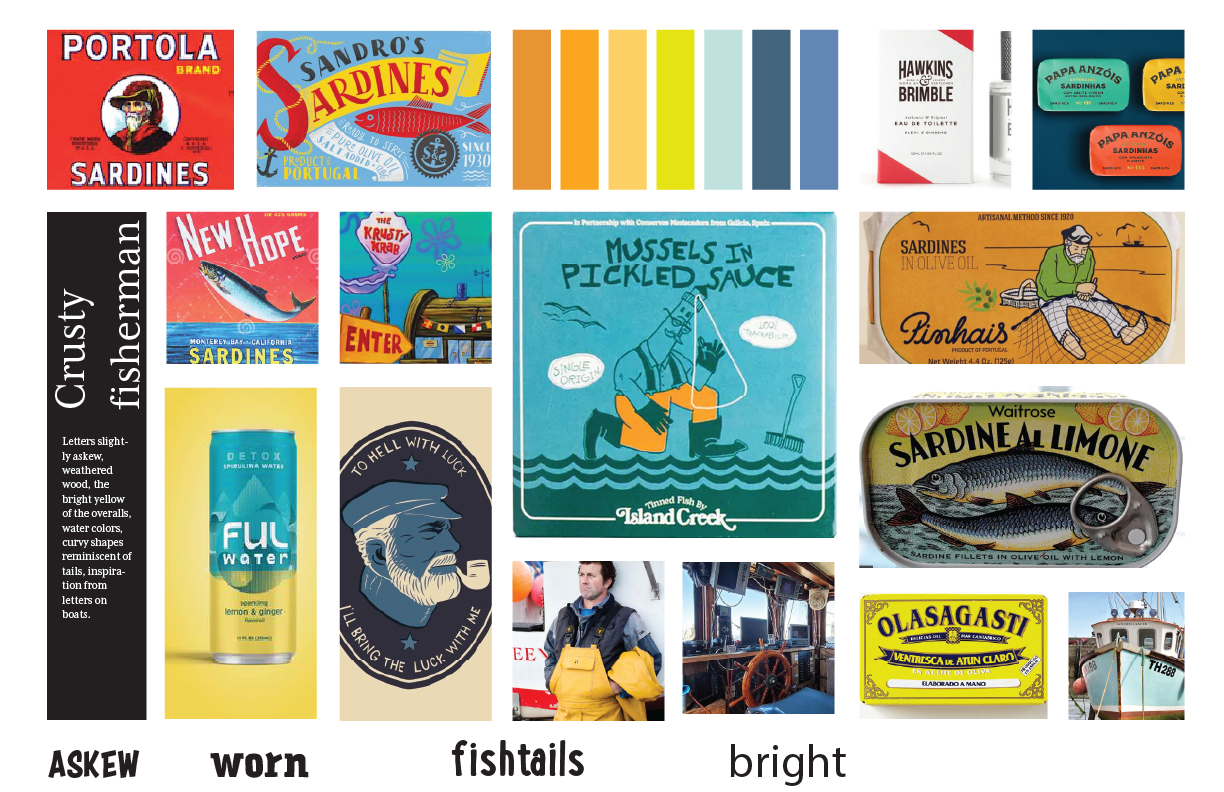
Old timey fisherman
Sketches
Digital Drafts - Round 1

Digital Drafts - Round 2
Challenges
Feedback I received, and how I responded:
There was a lot of white space on my initial design. I looked at the packaging as a whole on the dieline and tried to create more rhythm with the color blocks and white space.
Flavor colors would be useful to enhance visual appeal and aid customers in distinguishing and choosing the right product. I made bigger blocks of color on the front, sides, and back, and while I was doing so, added more wavy shapes to maintain the ocean feel. I still kept a lot of the main gray color because I still wanted to tie the product back to its original environment.
Reflection
In my last round of edits I played with changing the shapes and rotating the letters of “Sardines” on the front slightly to make them more playful and wonky. I’d like to go further with this.
Looking at my moodboards, there’s also more I could have done with textures, like worn wood or water.
It would be fun to pursue some of the other designs from my early sketches. A small sardine box lends itself to experimentation!