Publication Design
I design publications that inform and engage, whether through straightforward, data-driven layouts, or more experimental artistic layouts. Below are two examples of this: an impact report for a coalition of childcare experts, and a booklet highlighting the career of an influential designer.
Impact report for a coalition of childcare experts
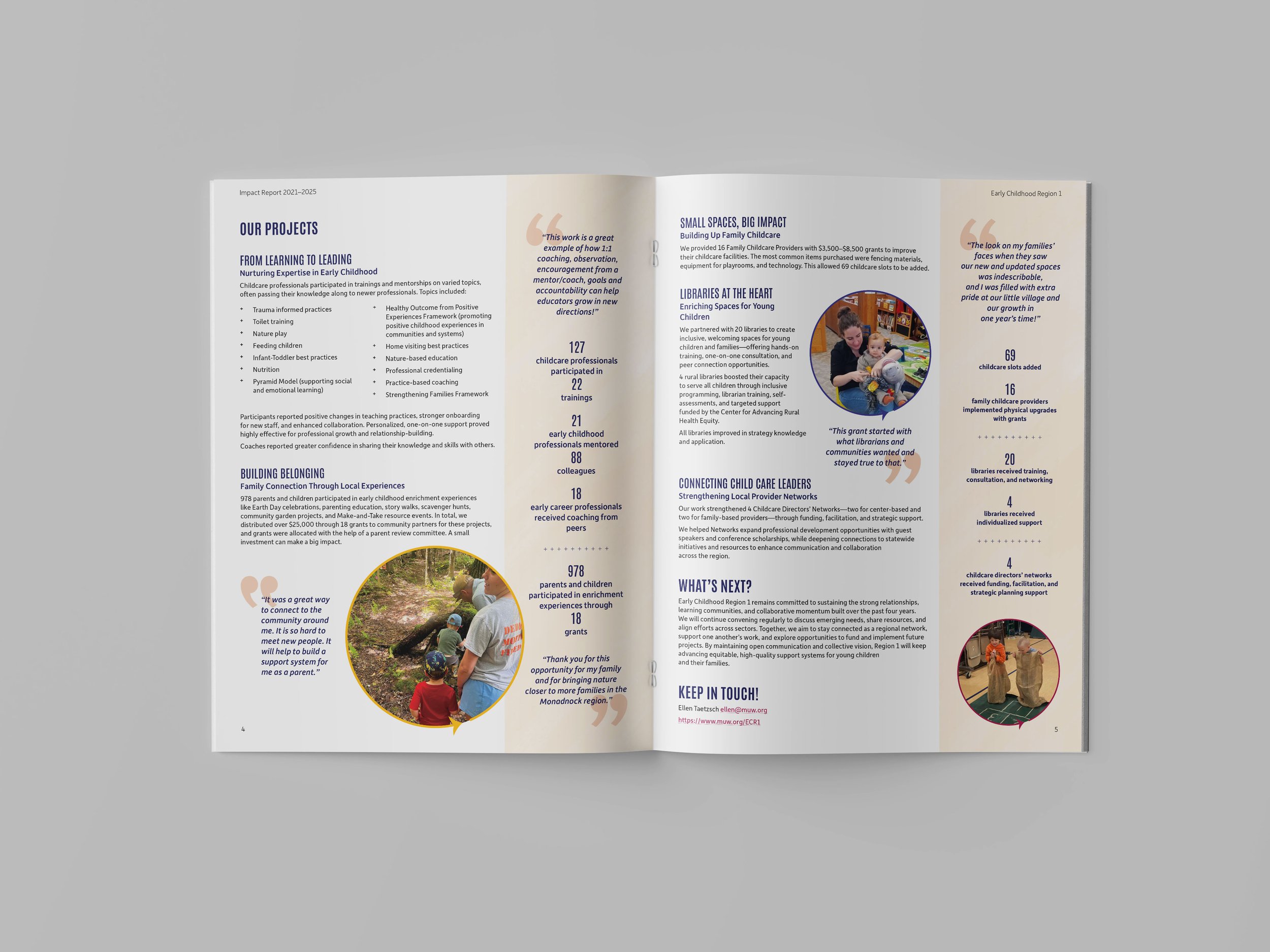
Challenge: to celebrate the accomplishments of New Hampshire’s Early Childhood Region 1 coalition of childcare experts over the last four years of their grant.
Solution: an impact report that visually emphasizes the connections between the organizations and the families they serve, and highlights key qualitative and quantitative data.
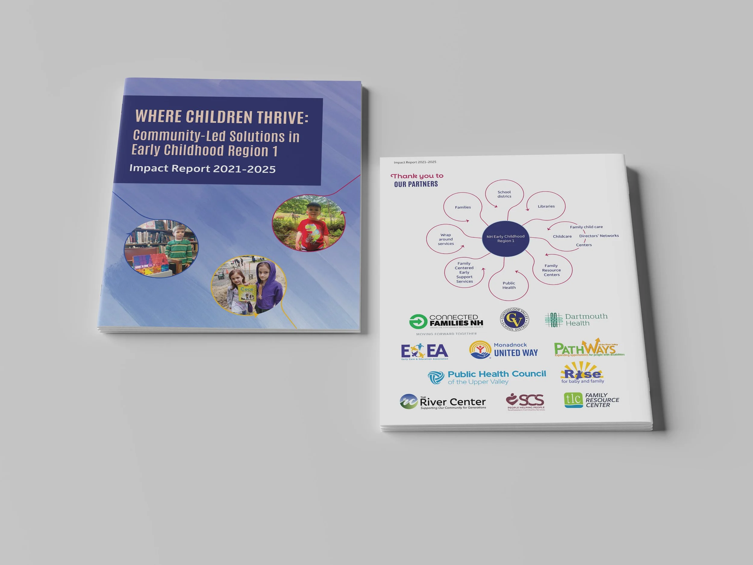
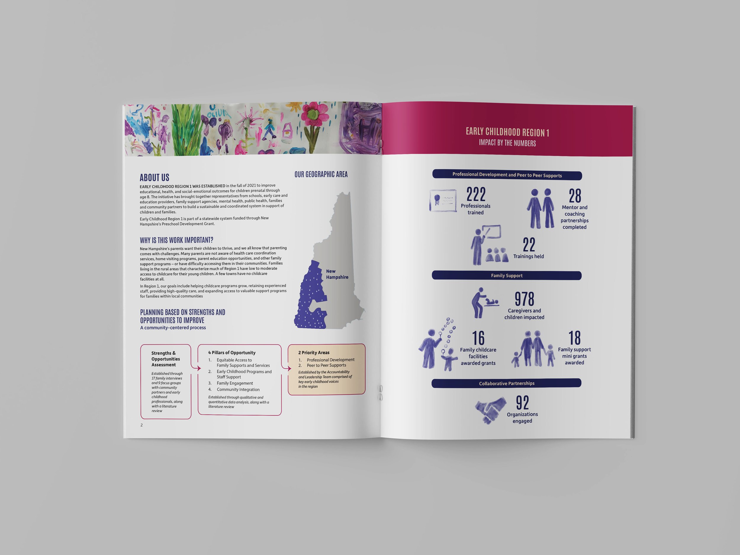
I collaborated closely with the Region 1 team to decide on a style guide that aligned with United Way (a sponsor of the project), but had its own distinct flair. The design elements are inspired by a children’s painting from one of the events they sponsored. I wanted visual references to childcare and children, while maintaining a cohesive professional appearance.
I decided on the layout based on the types of content that would be included: body text, project descriptions, project results (data), charts, photos, maps, partner logos, and quotes.
We communicated back and forth to find the best way of presenting information graphically, and to hone the text and callouts in a way that would most concisely and clearly highlight the coalition’s reach and accomplishments.
Booklet highlighting Lucienne Day’s surface pattern design
Challenge: To inform readers and design fans about the influential British surface pattern designer and artist Lucienne Day, whose optimistic, nature-inspired work evokes a specific time period, but who was always interested in new ideas.
Solution: “A Brand New Day” is a light and varied, easy-to-read showcase of images of Lucienne Day’s work, upon the backdrop of shapes from her designs, fabric textures, and natural elements. Through type and color, it evokes mid-century spaces, without being stuck in the past.
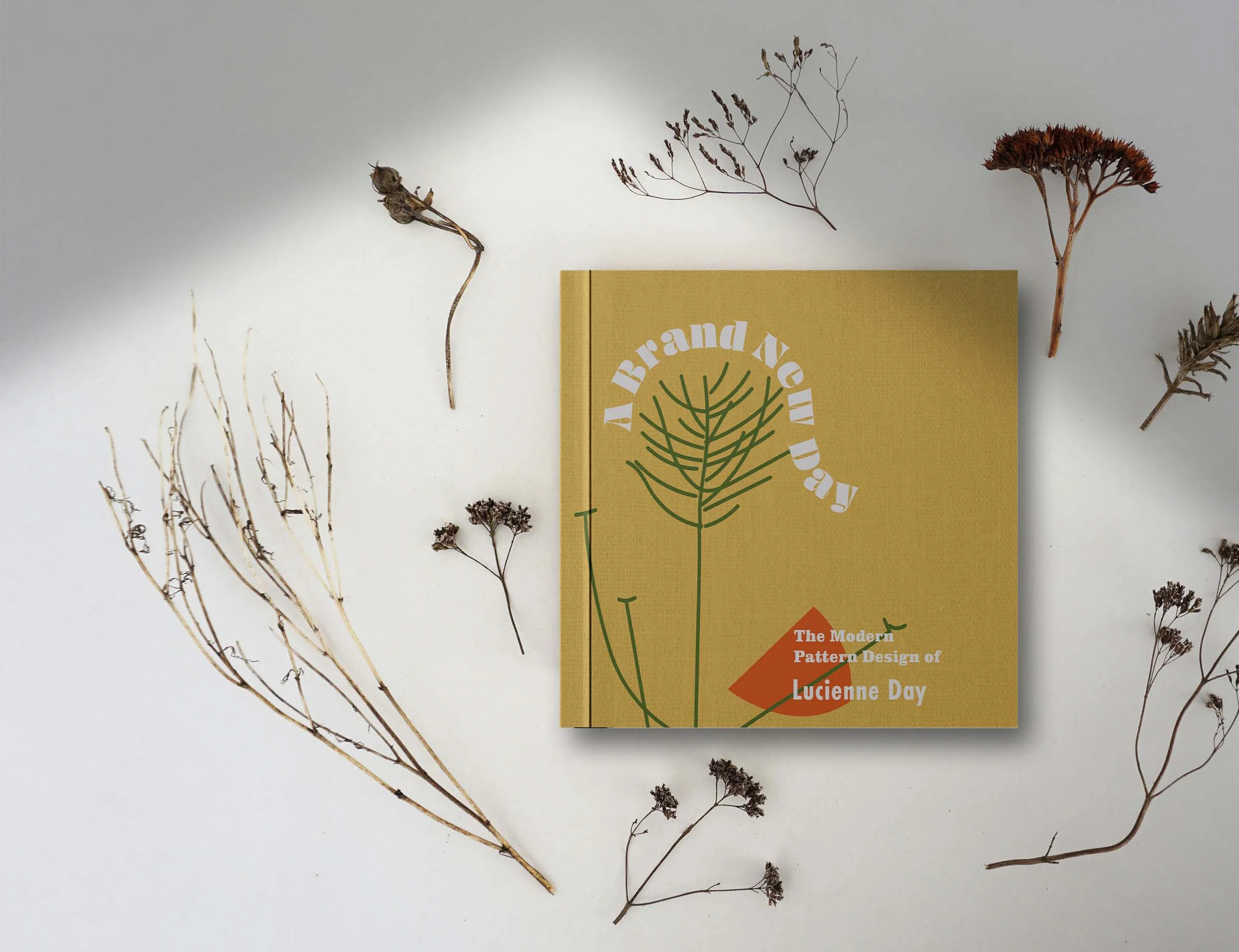

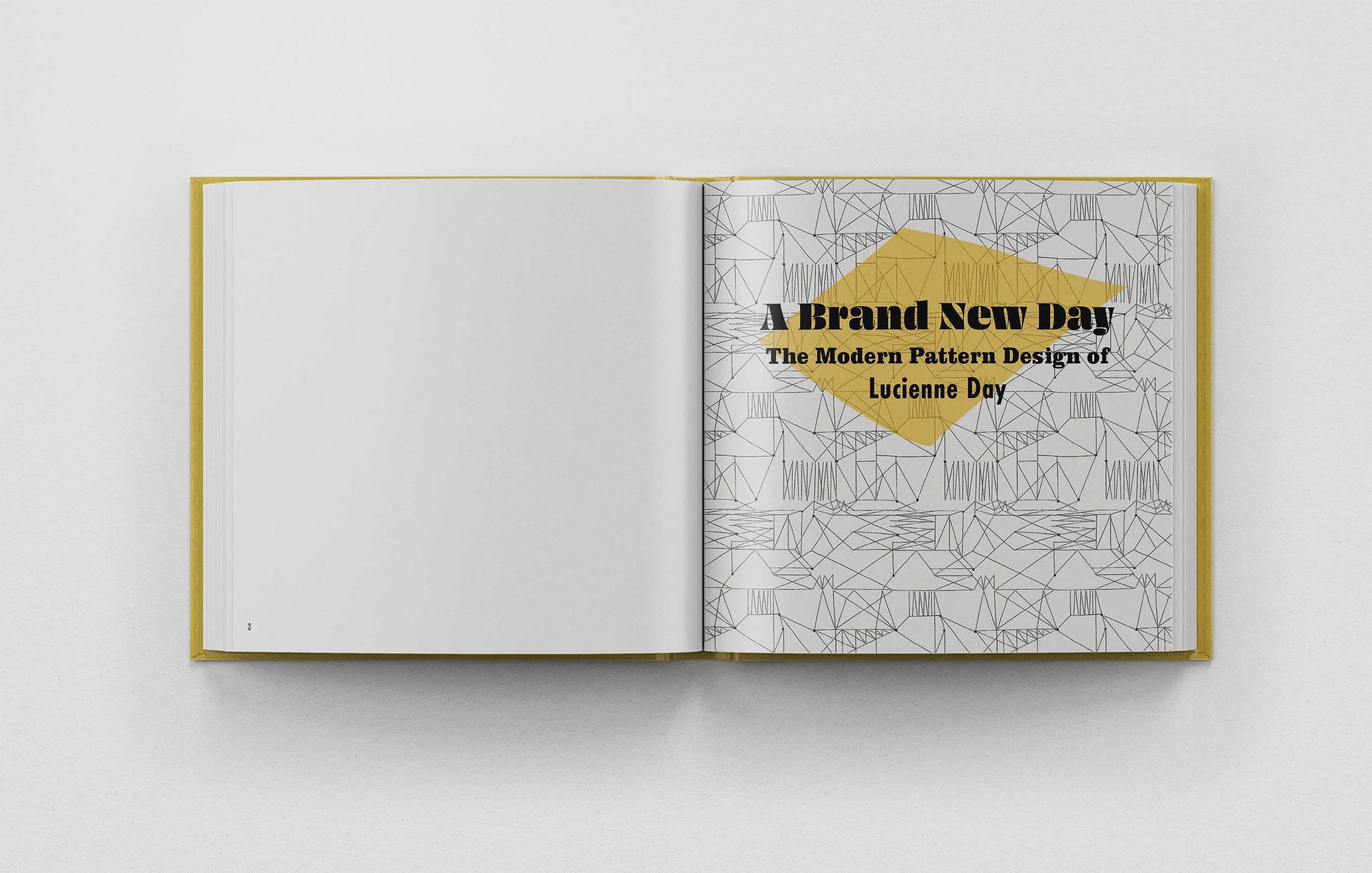
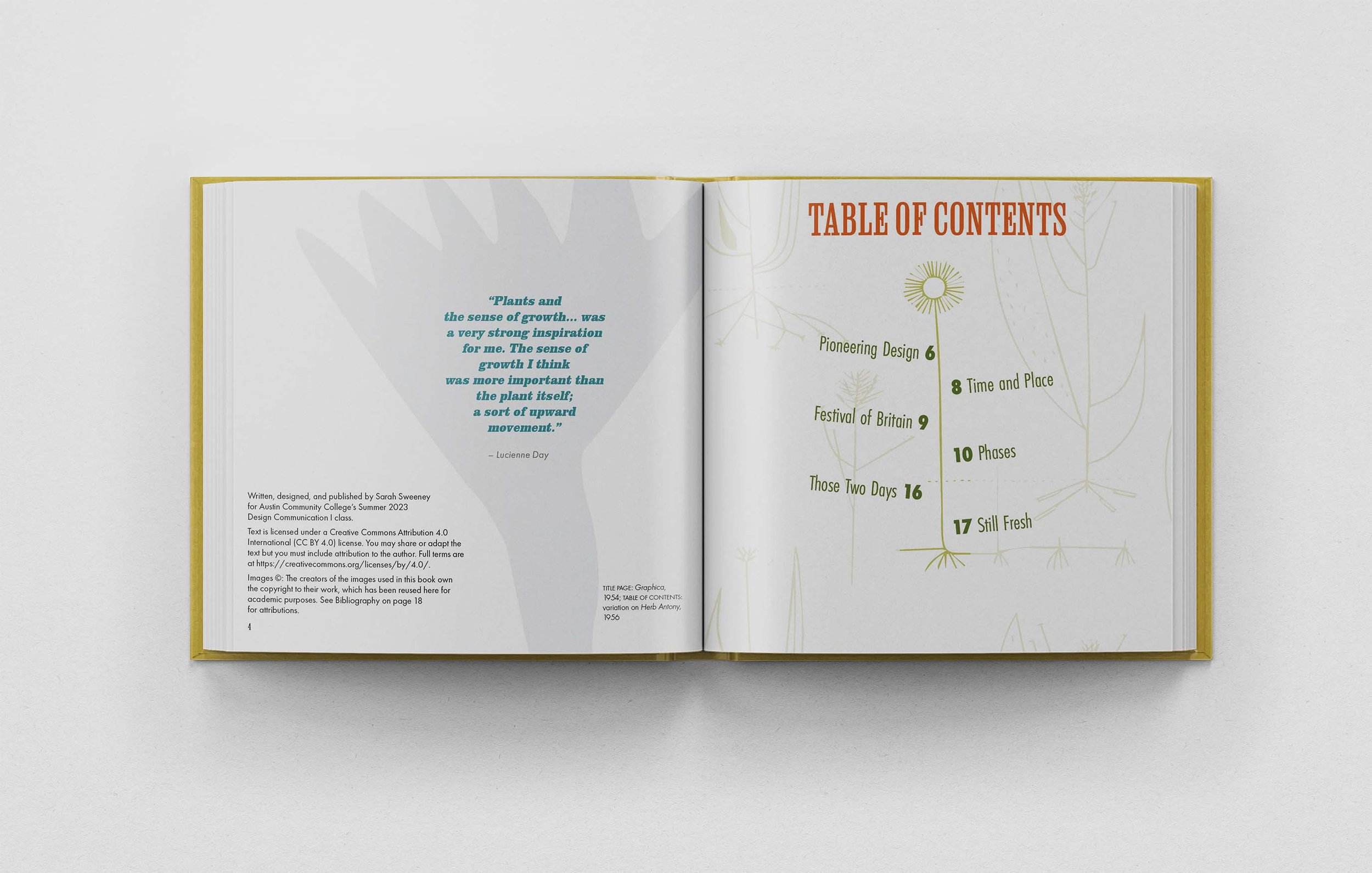
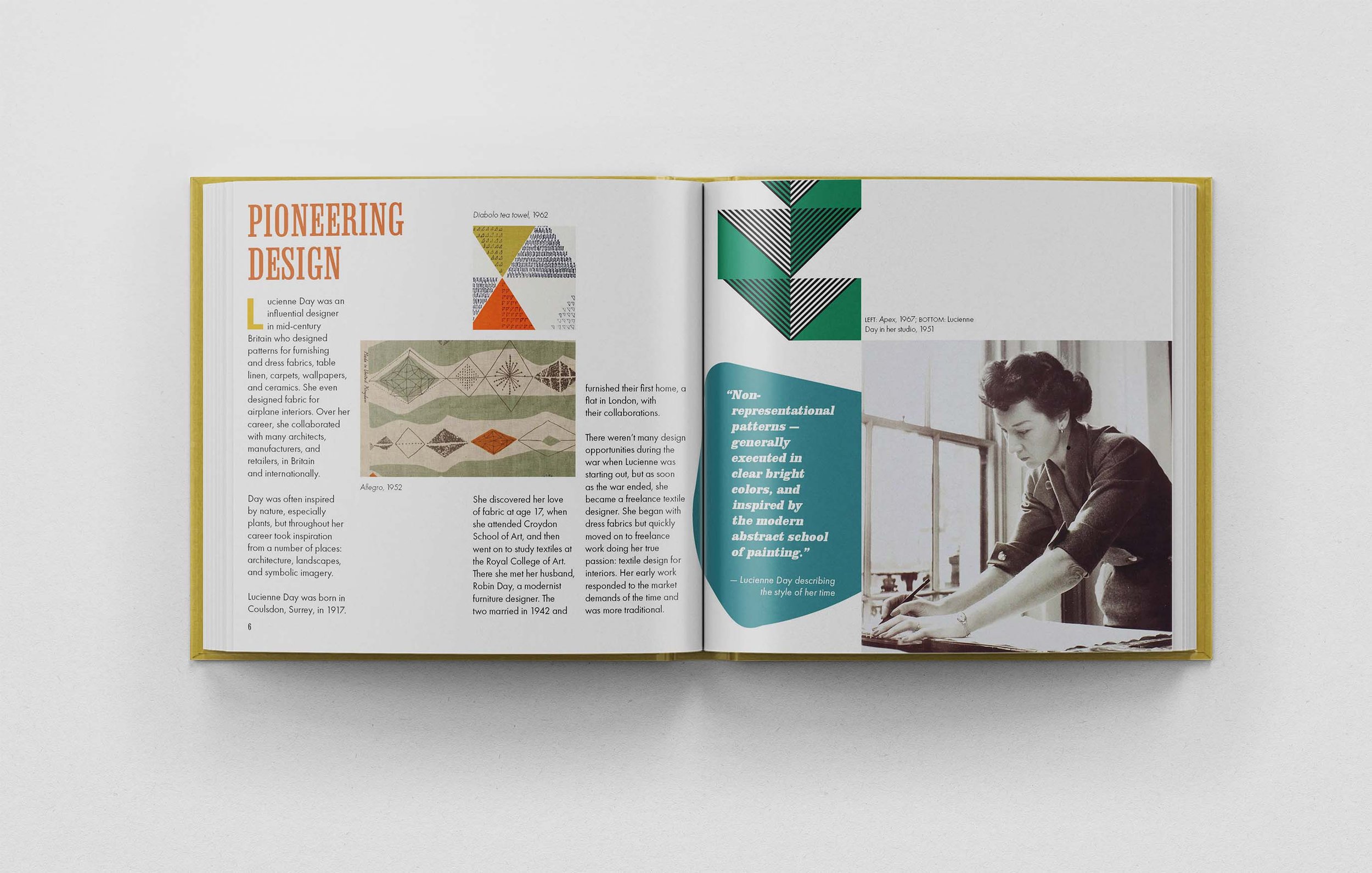

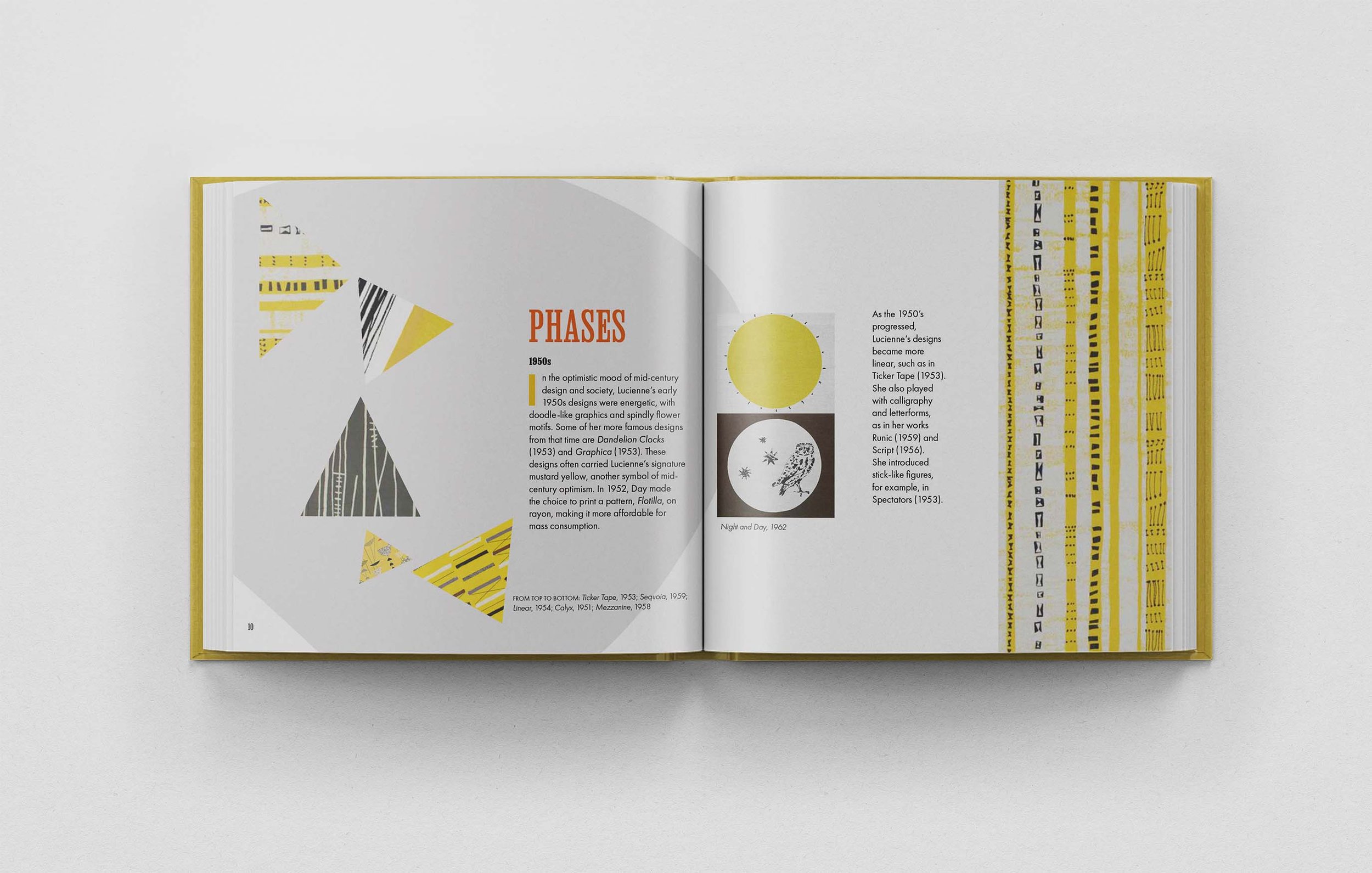
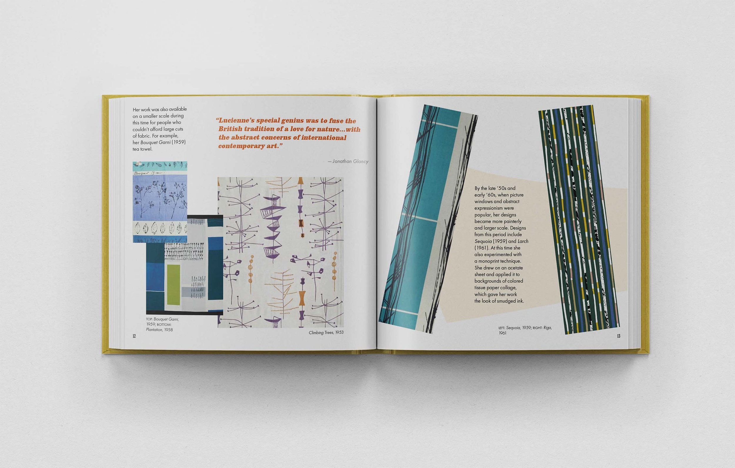
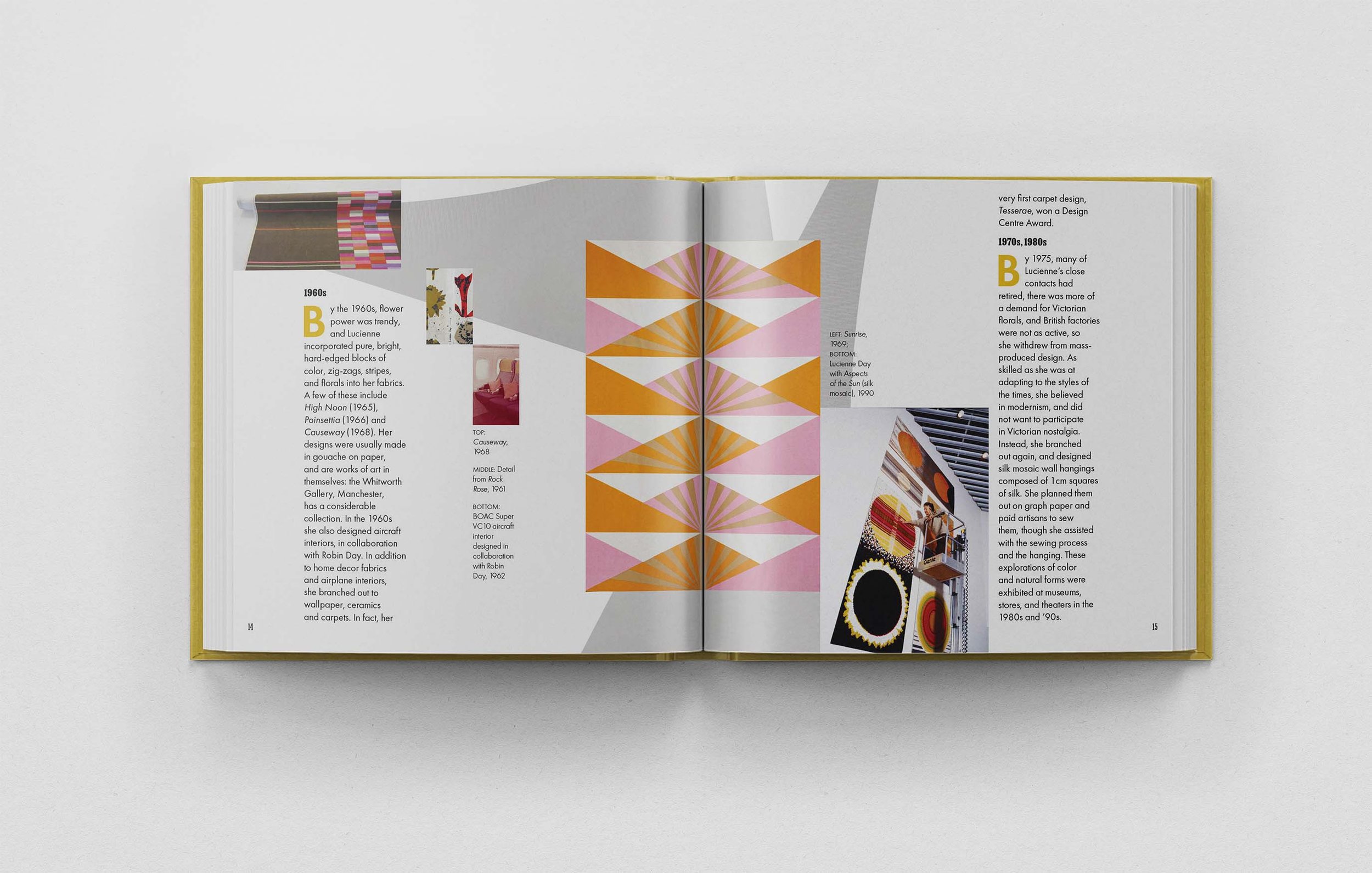

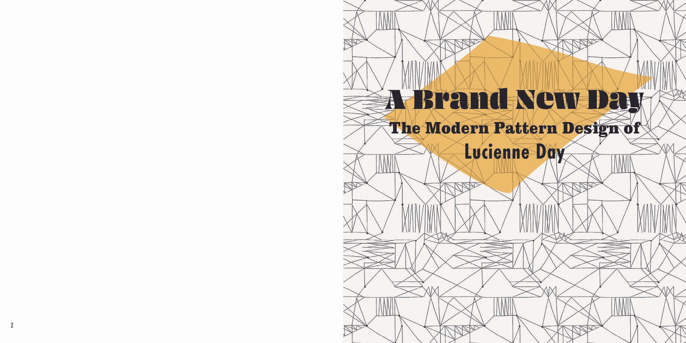
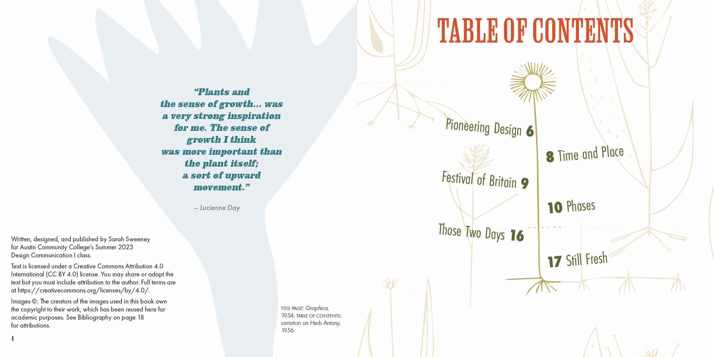
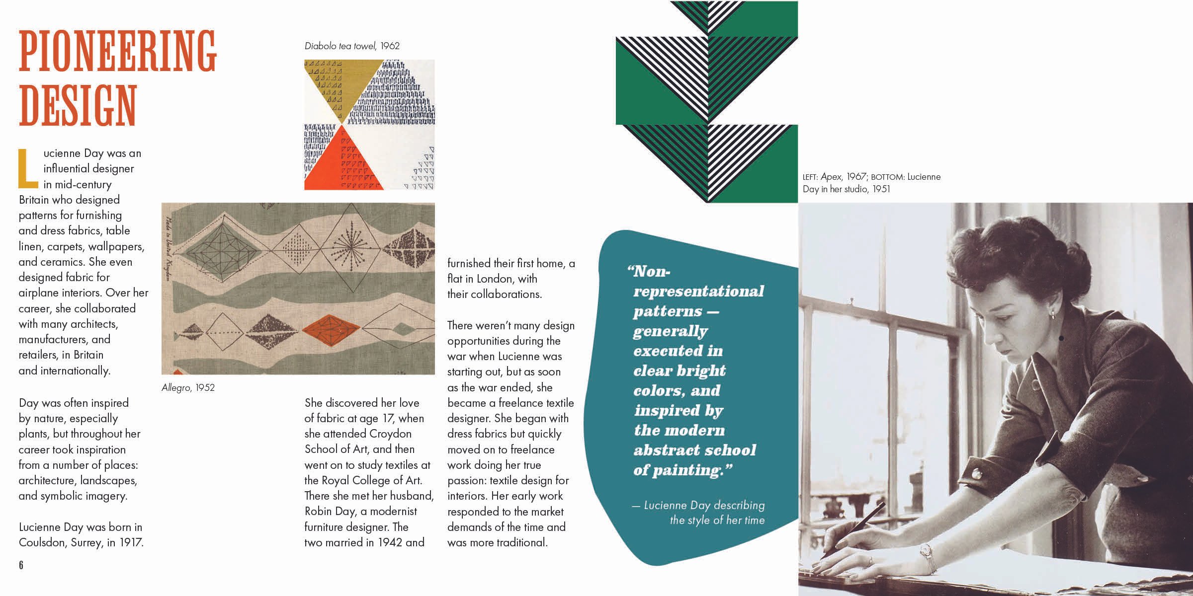

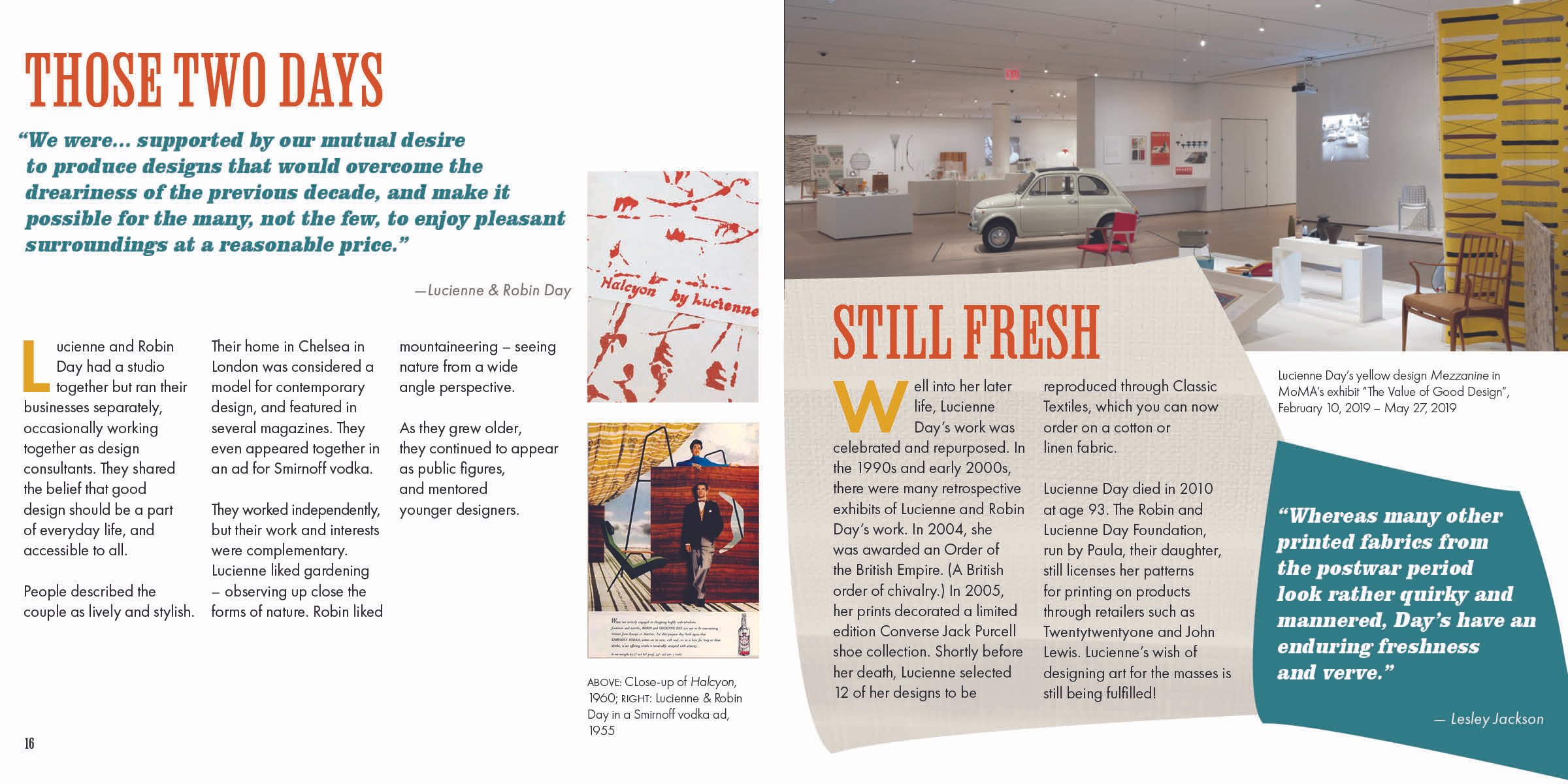

The final booklet uses shapes and concepts from Lucienne Day’s body of work as a backdrop for her designs to be showcased. Samples of her work are laid out as if they were scraps of fabric laid out for sewing. Fabric textures are balanced with white space for a sense of openness and lightness. Text box shapes are taken directly from shapes in Lucienne Day’s work. Yellow is one of the primary colors because it was prominent in Day’s work and represents mid-century optimism. The other colors are also from her work, as they were common in that time period. I took inspiration from nature in some of the heading text and in some of the floral shapes.