What Are You Going Through
Book Cover Design // Audiobook Thumbnail // Illustration // Poster
Challenge: To design a book cover that will resonate emotionally with highbrow and mass market readers.
Solution: A loose illustration and evocative colors that allude to the concepts in the book without referring to its literal content.
Cover Design


Styles
Concept
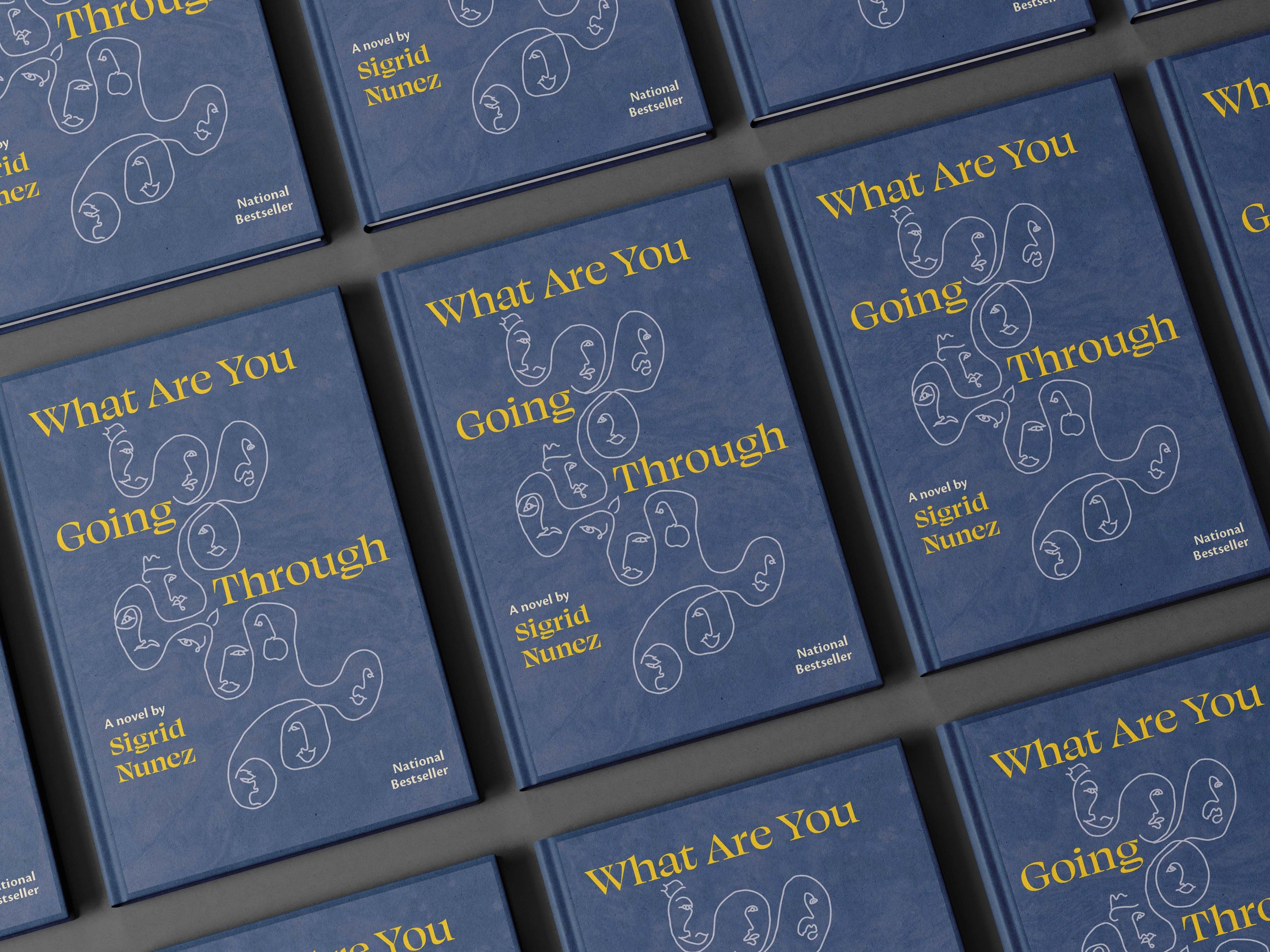
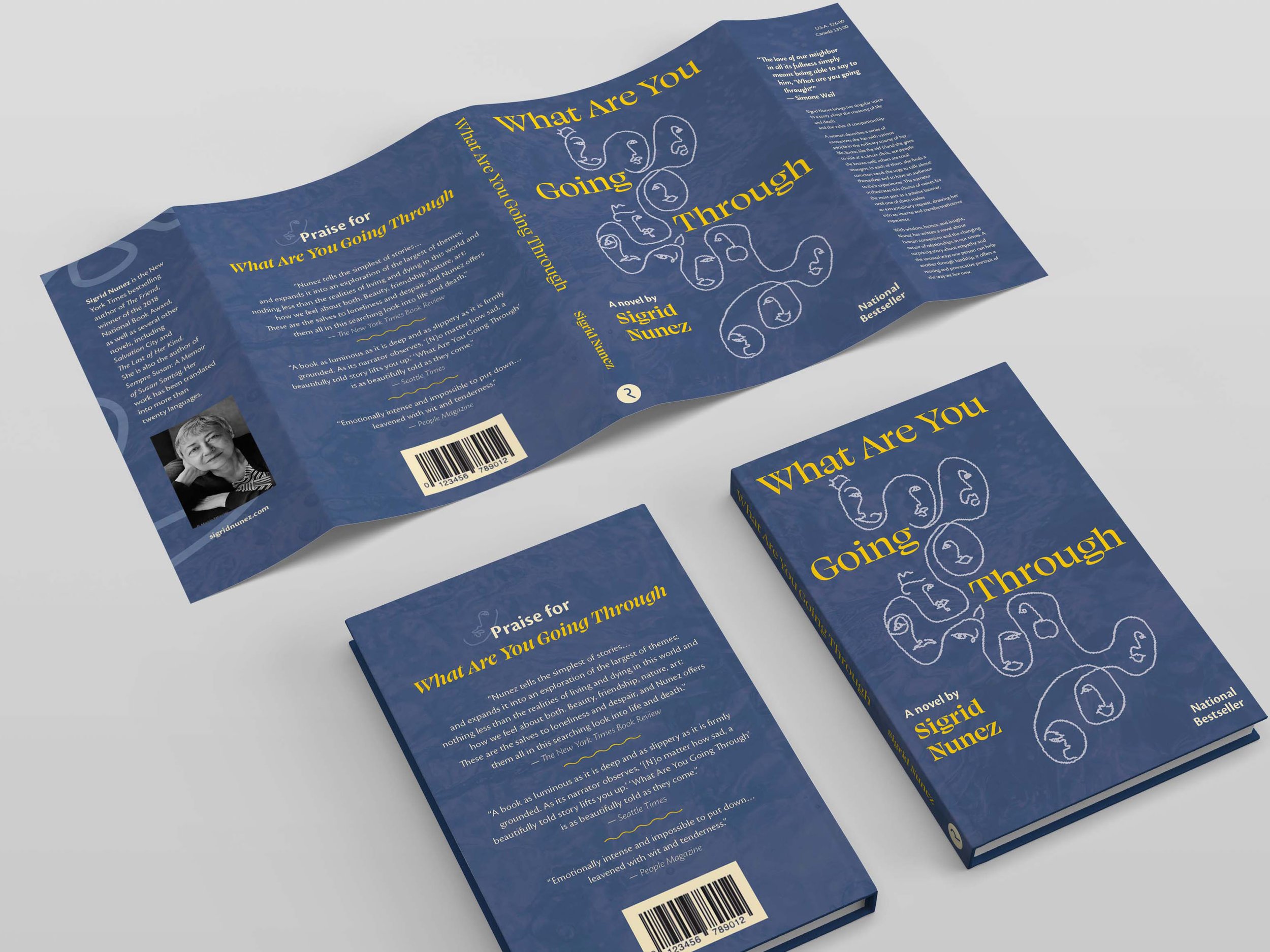
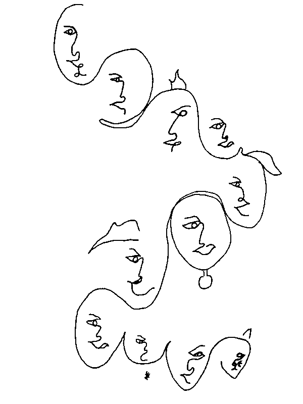
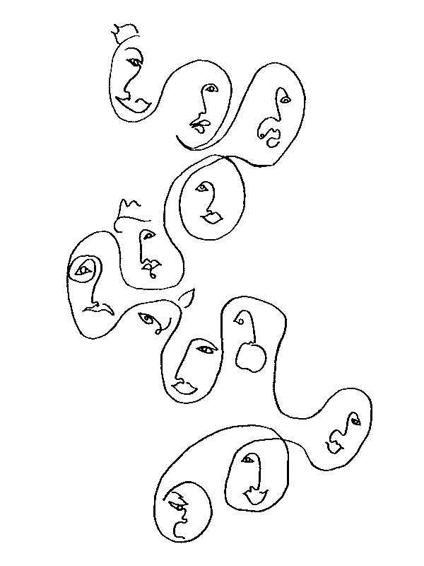
The interconnected loose faces represent human connection arising from the intimacy of individual stories, as shared with the narrator.
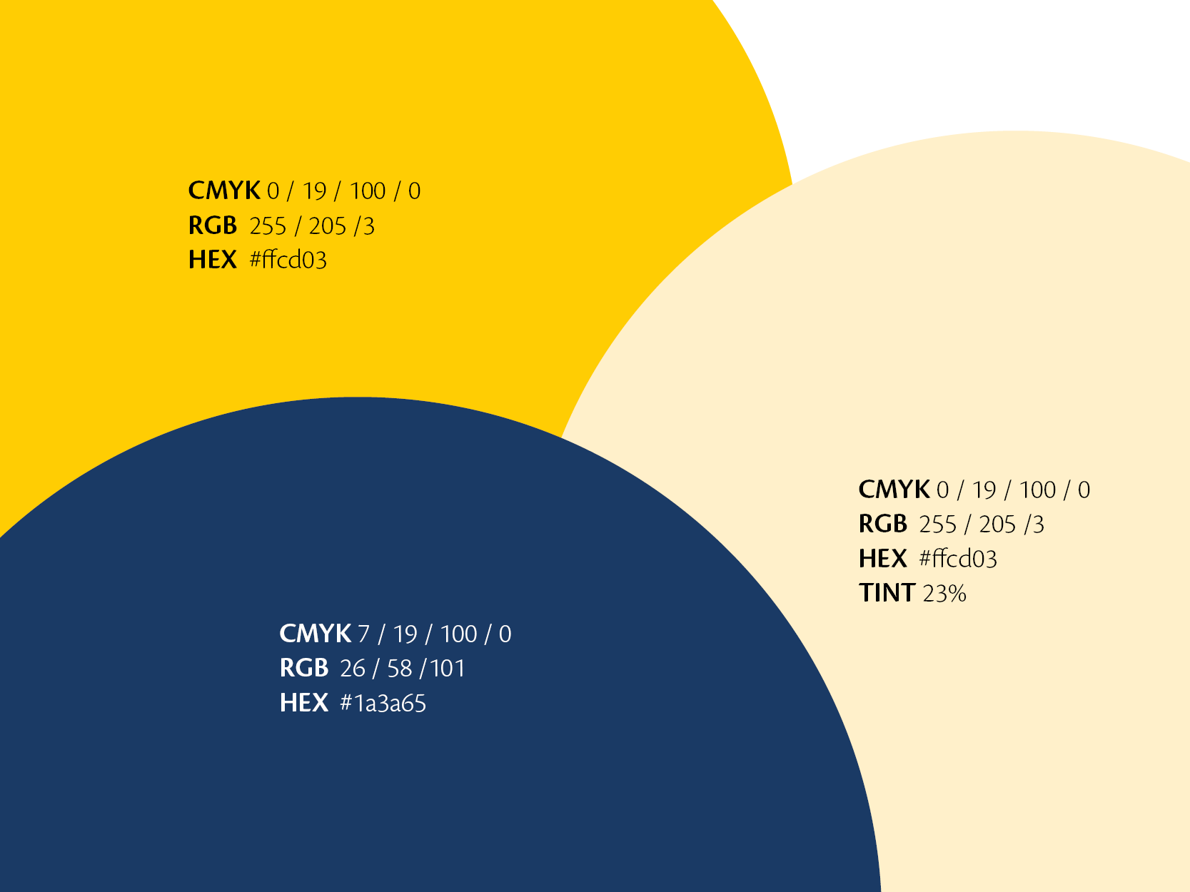
The colors convey a heartfelt balance of joy (yellow) and solemnity (blue) found in this human connection.
The facial expressions show the gamut of emotions in the book. (And there is still a cat.)
The words on the cover go THROUGH the image, in a reference to the title.
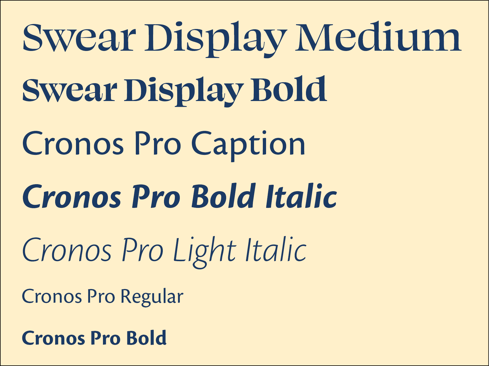
The display type, Swear Display, is a little bit quirky, which addresses the humorous aspects of the book, but the serifs add a more literary tone.
Design Process
Brief
“What Are You Going Through” is about a woman, the unnamed narrator, whose long-time friend is dying of cancer. The friend asks the narrator to accompany her on a trip, so that she can end her own life in peace. Themes of the book are women aging, fear of death, relationships/friendships, the different forms of love, the need for connection, passage of time and regret, and intimacy. Despite the serious themes, the book has plenty of light, humorous moments. Sigrid Nunez, the author, is a National Book Award winner.
The target audience considers reading to be an intellectual pursuit, not just for entertainment. They may read book reviews in the New York Times or hear about books on NPR. Since the book discusses aging, they may be 40+. But the book could appeal to a much wider audience because its themes are universal and the writing style is direct.
The goal is to design a book cover that grabs readers’ attention on the shelf and conveys the book’s concept and mood, rather than its literal content.
Research Insights
Most of the existing covers for the book center on the cat in the story. (For context, the cat is a minor character, but memorable because he speaks to the narrator.) I love cats and enjoyed these covers. I can understand how it would appeal to readers, but the cat is only one of a cast of characters whose interconnected stories add meaning to this book.
Most of the covers used blue and/or yellow and I found this to be a smart combination to convey the contrast of sadness and happiness in the book.
In the top row, a selection of existing book cover designs. In the bottom row, other illustrations that I found accompanying reviews and blurbs of the book.
Theme Boards and Moodboard
In the theme boards, I collected images related to confronting death, connection, and women aging/crone archetypes (shown below from left to right). In the moodboard, I focused on collecting images that would show the emotions behind these themes: human intimacy, love, interconnection, loss, and grief; and the blue and yellow color palette (the furthest image to the right below).

Theme board: confronting death

Theme board: connection

Theme board: women aging

Moodboard
Brainstorming and Sketches


Digital Drafts - Round 1
Digital Drafts - Round 2
Clockwise from top left, versions go from earlier to later and move through a range of blue backgrounds
Illustration Process

Sketched a lot of faces
Practiced sketching connected faces
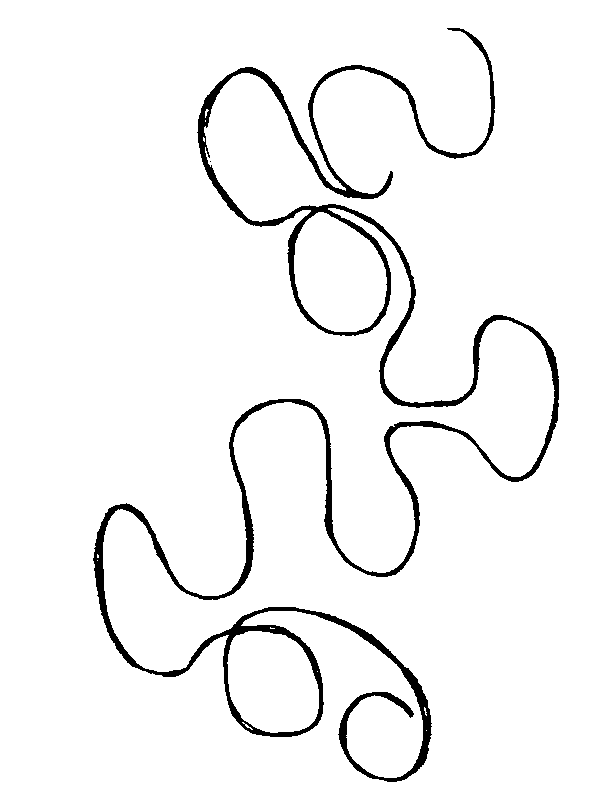
Chose the outline shape

Traced favorite faces from various sketches onto outline
Went over with ink and scanned
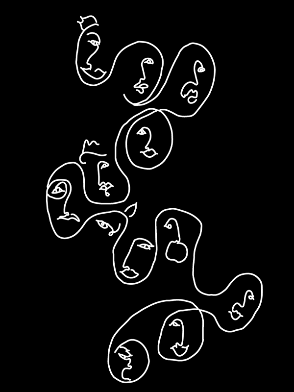
Image traced in Illustrator
Challenges
Finding the right blue. My initial blue vibrated too much. The lighter blues I tried didn’t contrast enough with yellow. The final darker blue did the trick.
Texture. I received feedback to add texture to the cover. First I tried an opaque layering of my face sketches as a background, but it was messy. My eventual solution was to use an opaque water background, which is a reference to an earlier rejected concept: two people on a bed floating in water (a pivotal scene in the book). Water fits with the color scheme, the squiggly lines of the illustration, and with the fluidity of emotions I want to convey.
Reflection
I love books and covers are one important factor for me in choosing a book to read. I had read this book recently and was touched and surprised by it: a perfect book for which to design a cover.
During this process, I felt that a book cover is a perfect space to play with ideas because it has different areas, each with its own size and purpose: the flaps, the front, the back, and the spine. And InDesign is a perfect, and enjoyable, tool for doing this.
In the future I’d love to design a sci-fi book cover, which would offer the chance to bring an imagined world to life on the page.