Nice, France Logo and Campaign
City Branding
I developed a logo and matching multichannel advertising and merchandise campaign for Nice, a coastal city in southern France.
Styles
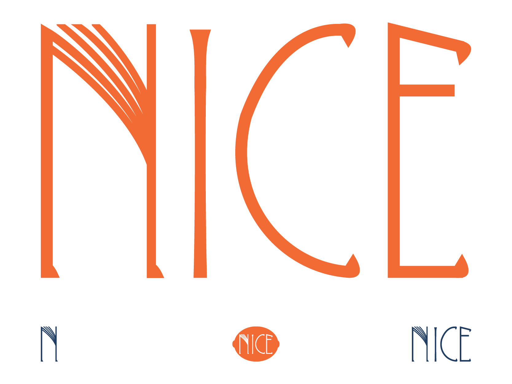
Logos
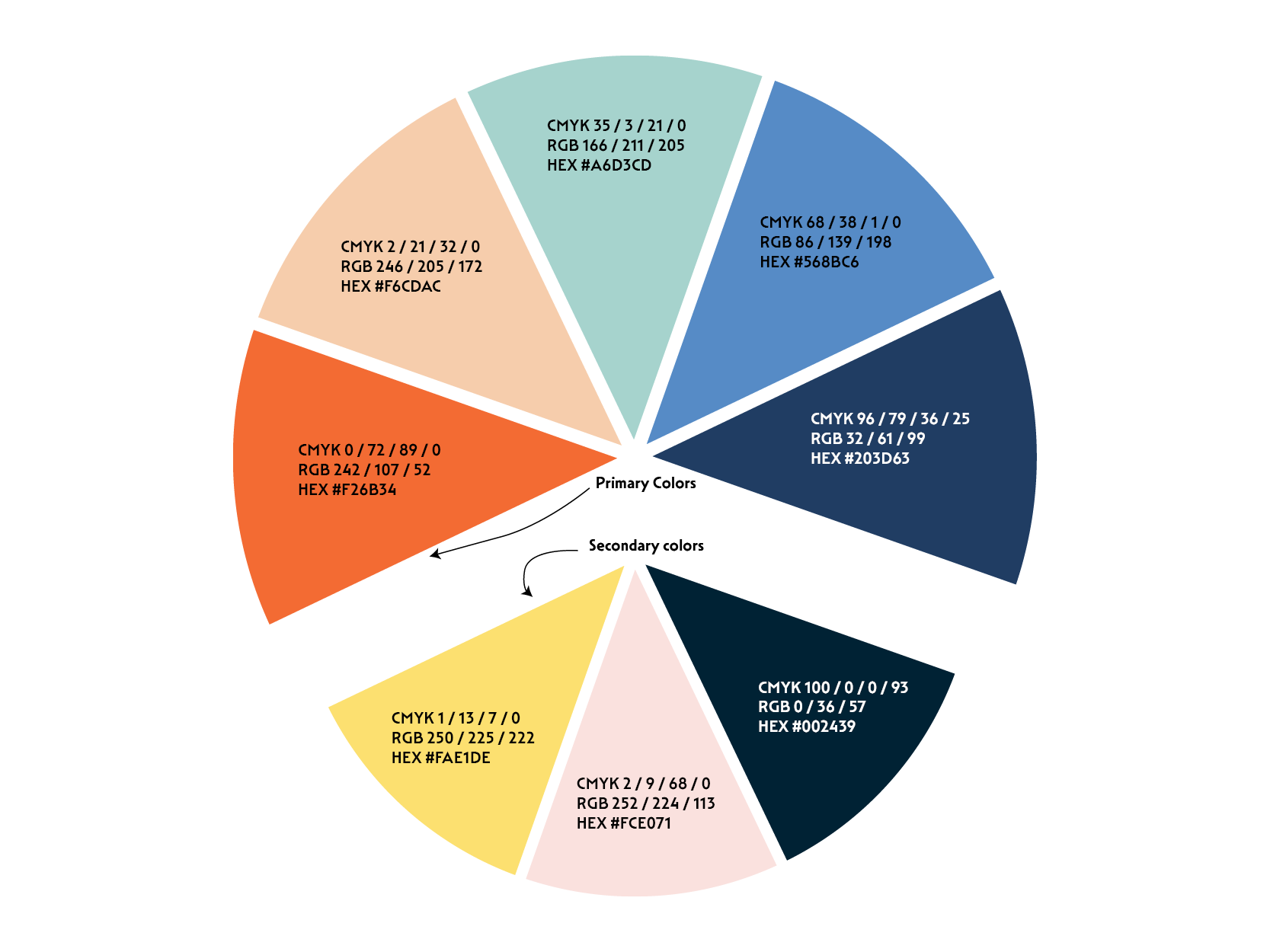
Color Palette
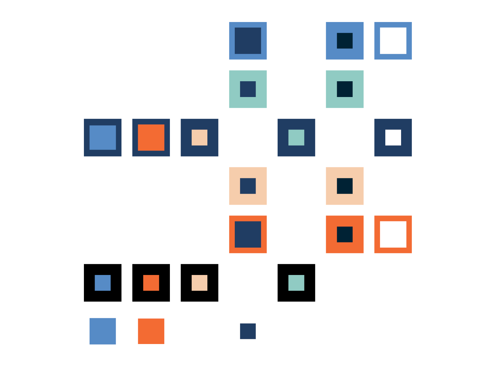
Color Contrast
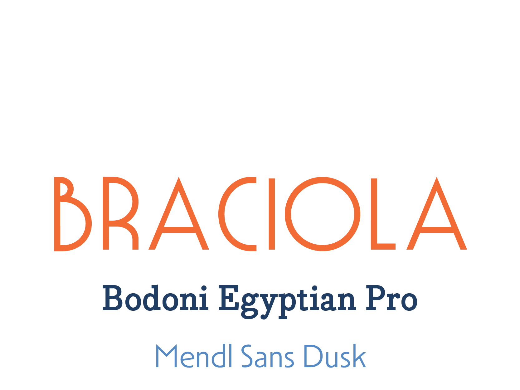
Typography
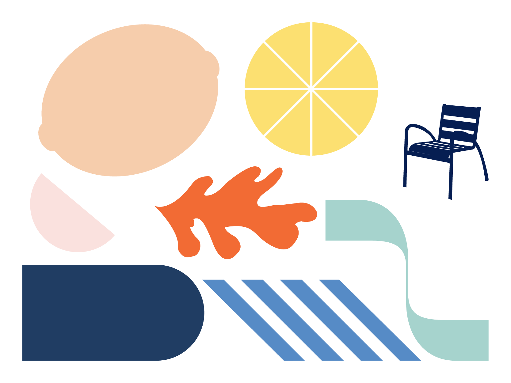
Shapes
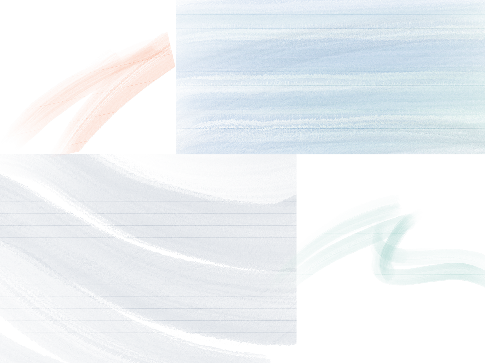
Textures
Applications
Concept
Visit Nice! It is fresh, sunny, sophisticated, airy, colorful, and light.
The logotype references many visual elements from Nice: the stripes and arches of market awnings, the bumps and curves of bright citrus, the waves of the ocean, and Art Deco style. The result is a fresh, light, and refined logo.
The color palette supports this mood: watery blues and blue-greens, the warm and peachy tones of the architecture, and the bright citrus pop of the farmer’s market.
The shapes also reference the varied offerings of Nice: a Matisse-style curvy leaf, a citrus fruit, a beach chair, a curvy oceanic letter stroke from one of the “N”s in my typographic research, and general soft round shapes.
Read more about my process…
Brief
Nice is in southwest France on the Mediterranean sea, about 20 miles from Italy. It has been settled over millennia by different groups of people. It’s a colorful and sunny winter getaway for people from colder climates and has often been an inspiration for artists. It’s known for its beaches, art, open air markets, history, parks, Carnival and flower parade, nutritious Mediterranean food, and architecture.
The target audience is Americans who have just discovered Nice as an alternative to more famous northern French tourist destinations. They’re seeking a slow paced vacation and a connection to nature. They are adults with some disposable income, in the 30-60 year old range. They like culture but don’t want to spend their whole vacation in a museum. They may be more health conscious and appreciate Nice’s athletic activities and fresh, healthy foods.
The goal is to signal Nice’s refreshing vibe in its logo, and to use this as a jumping off point for a brand, which will attract new visitors to the city and differentiate it from other French cities.
Research Insights
I had a blast researching Nice. I had been there for two short visits but I discovered lots in my research that I hadn’t experienced when I was there.
It stood out to me that Nice was settled by lots of different groups of people. When it became part of France it was intentionally developed as a vacation city. I wanted to show everything Nice has to offer but I always kept beach relaxation in the front of my mind. I was also inspired by photos of beautiful Art Deco architecture, and my own photo of citrus fruit piled in a Nice market.
Three Moodboards
One moodboard focuses on general Nice inspiration, one on early 20th century Nice Art Deco and poster designs, and one on Matisse’s time in Nice.
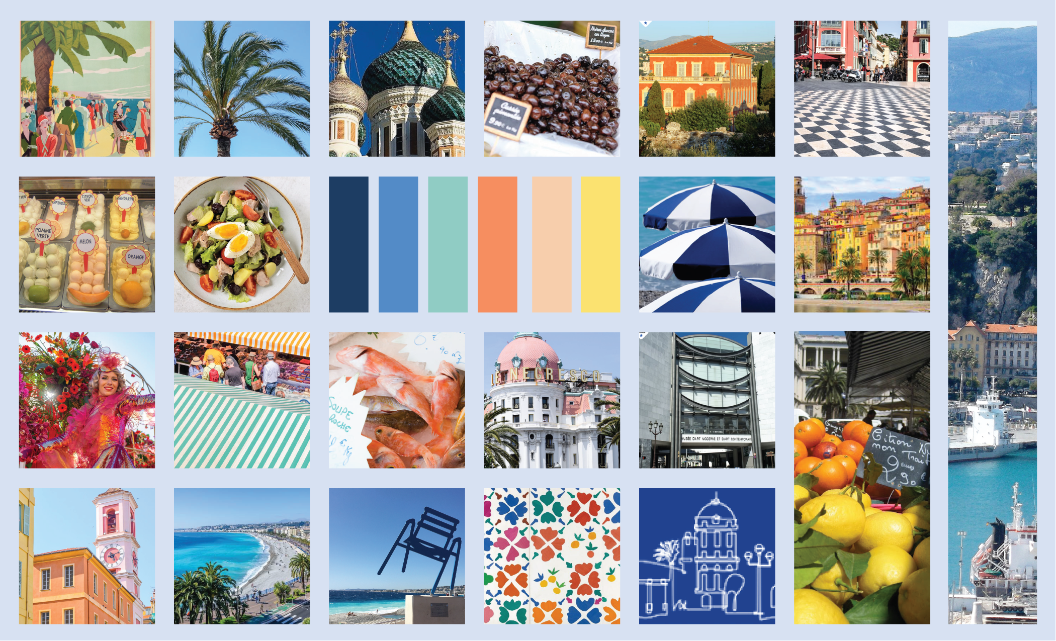
General Inspiration
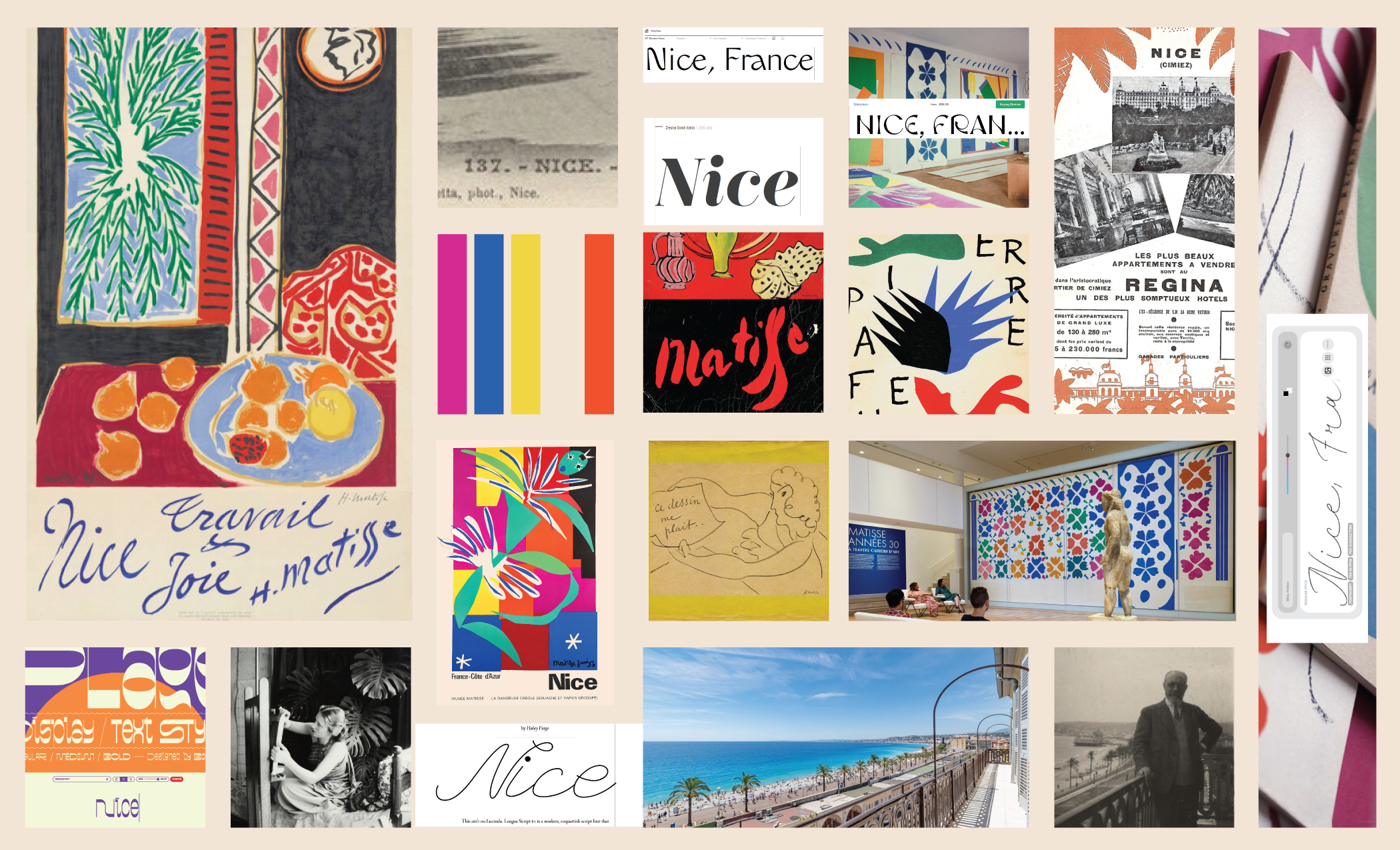
Matisse
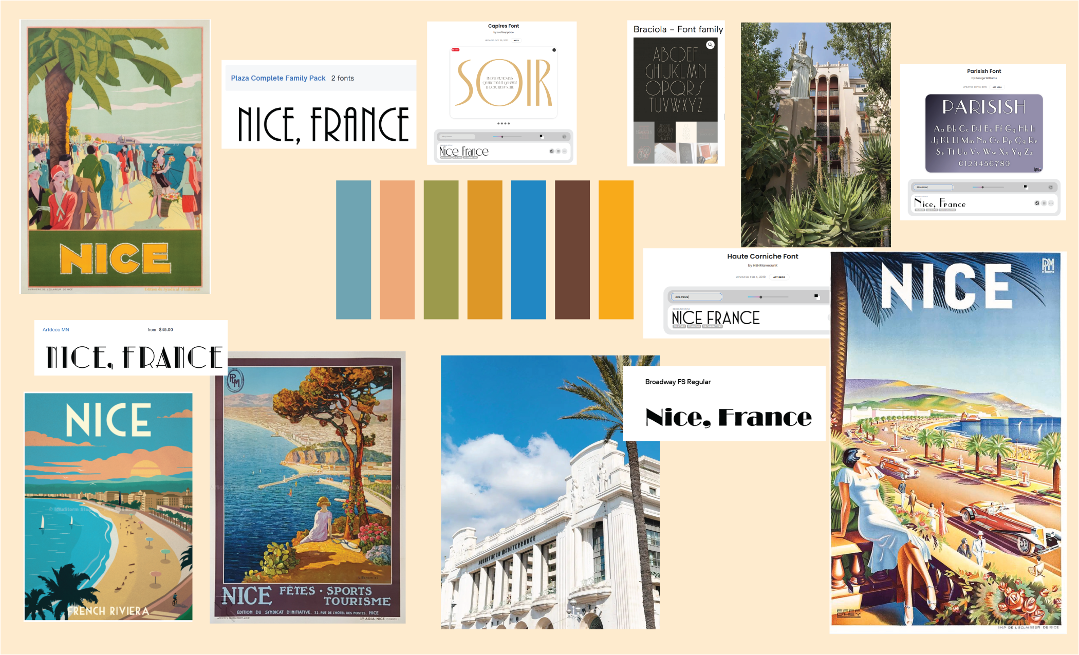
Art Deco Travel Poster
Brainstorming
Logo Sketches - Rounds 1 and 2
Sketches take inspiration from the markets and products sold there, the architecture and its textures, and the beaches and other natural landscapes. The typography is derived from my research in beachy, Art Deco, and French typefaces.
Icon Sketches - Round 1 and 2
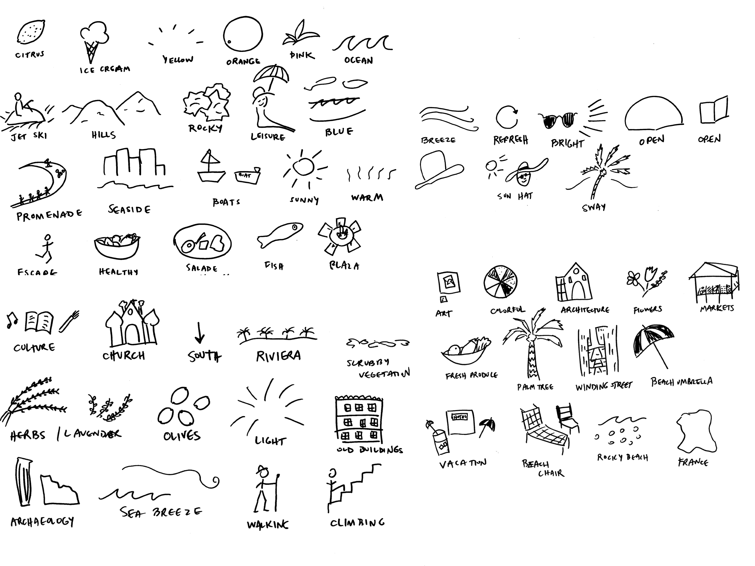
Round 1

Round 2
Logo Digital Drafts
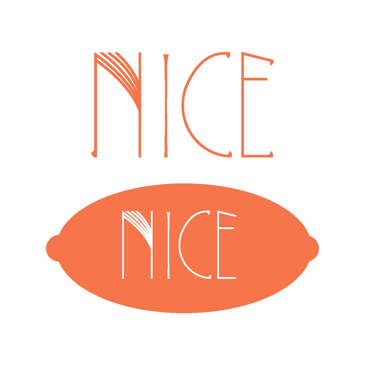
Inspired by Nice markets, ocean, and art deco style
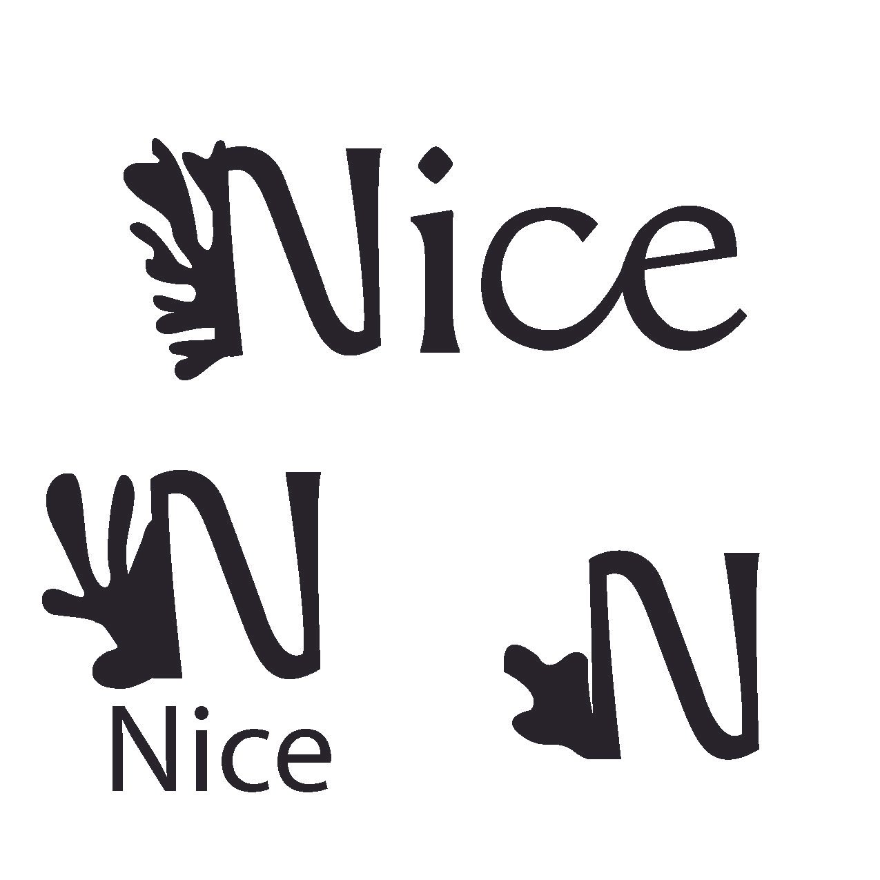
Inspired by the art of Henri Matisse, who painted in Nice
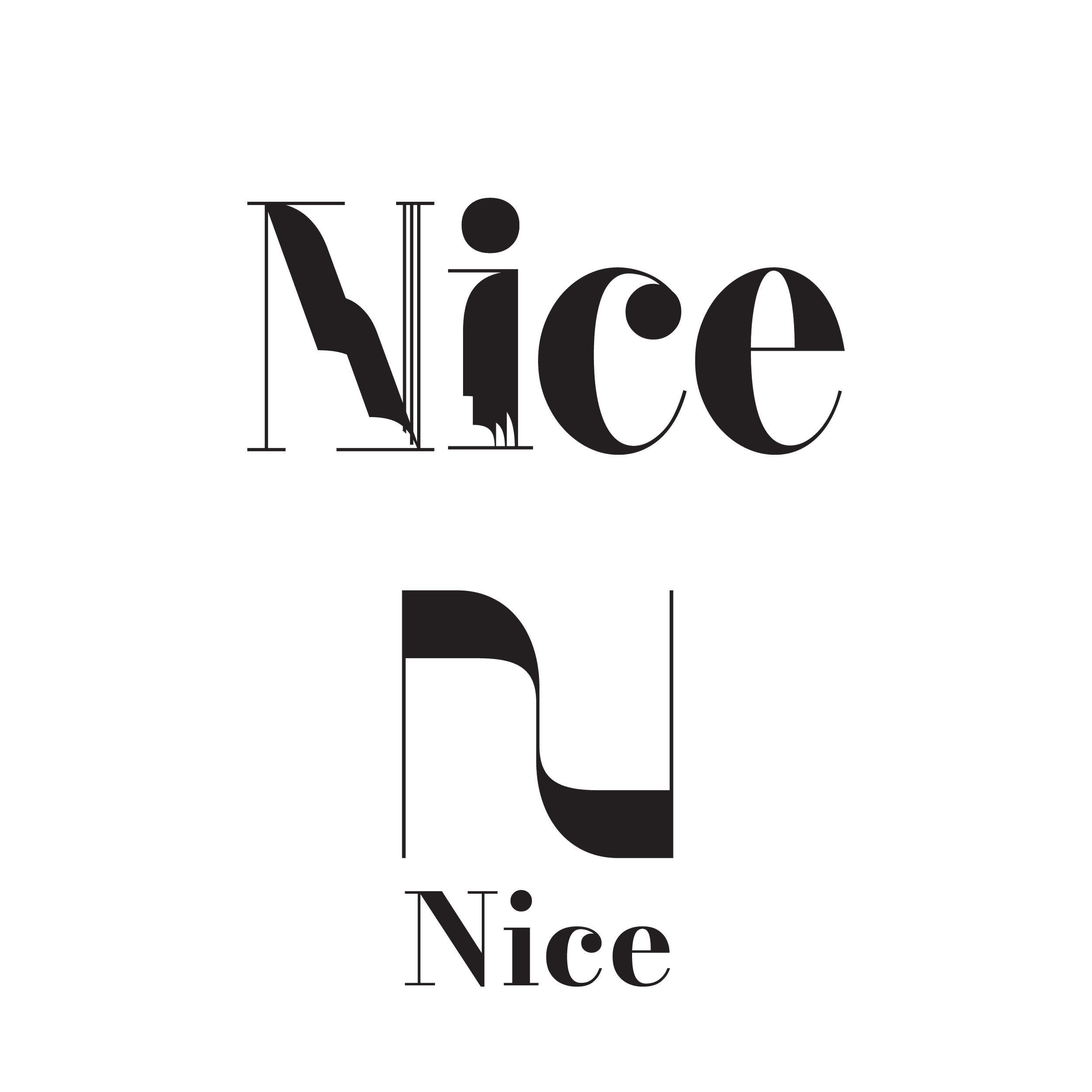
Inspired by the beach and Art Deco repetition of shapes.
Challenges
Color. I had to revisit the colors for this project. I derived my initial color palette from my moodboard. The colors worked well together in rectangles on a white background, but many of them vibrated when overlapped in my designs. The blue was too bright.
I went back through my inspiration photos and used different tools (Adobe Colors, coolors.co, tints and shades in Adobe Illustrator) to come up with color options. I mostly tried to keep the theme of warm, bright colors contrasted with blue. At one point I also tried making a palette with multiple tints and shades of green contrasted with warm colors. I liked that this emphasized the city’s nature, but green seemed to change the feel of the brand and diverged too much from the beach theme, so I went back to blue.
When I was testing new combinations, I made sure to overlap the colors on top of each other to see how they’d look, and checked the contrast of each color pairing to make sure I had enough options for combining the colors. I also decided to lean in more to white as a background, which added to the fresh feeling I was aiming for and made contrast easier.
Wayfinding icons. These icons also required many reworkings. As you can see above in the icon sketches, they were too detailed to be icons at first. I simplified them (seen in the directional sign directly below), but they didn’t look like Nice. I received feedback to stylize them like the logo, so I added the small embellishments and borrowed some shapes from the logo to use on the icons and I believe they now match the overall style.
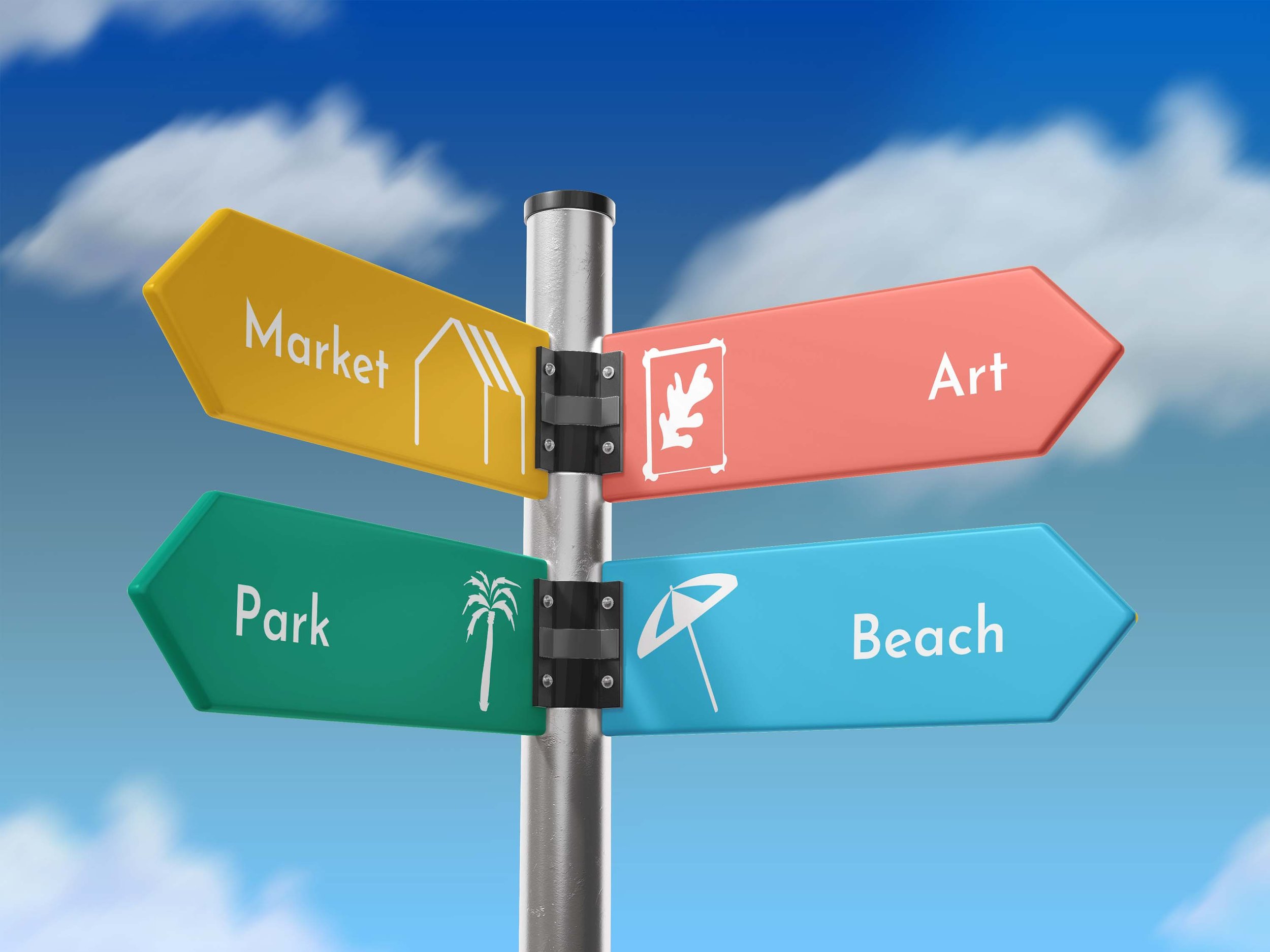
Original color palette on a wayfinding sign
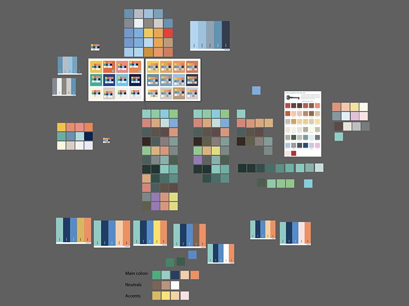
Color palette experimentation in Illustrator
Reflection
As I discussed in the Challenges section, I learned a lot about choosing and planning color palettes from this project.
I can think of lots of ways of expanding the project to celebrate Nice’s huge range of offerings. I’d love to create an ad campaign for the city’s parks. When I was researching, I saw that France was emphasizing sustainable travel, and I think it would have been fun to lean more into the nature in Nice and to explore using more green in my designs.
In my early drafts, I didn’t feel that I used shape and color cohesively. I improved it in my final designs, but I noticed that some of my designs look brighter and some look pastel, which may not look cohesive to viewers.
This project also pushed me to explore lots of typefaces, and I discovered lots of new sources and foundries that I will continue to refer to.


